The Importance of Presentations for the Mining Industry

The Mining Industry was seen as an old-school investment, it was painted dirty by eco-zealots, over-taken by the Crypto Cool Kids, and dismissed by new-age financial whizz kids as falling behind the fads.

Those days are over, thrown down a well that is then capped with used tailings. Why?

  • The environmental persuasiveness that worked its way on the left-leaning of society, has gone through its cycle and now lies in taters: Economies need resources for materials. Grids need baseload power. Hello Coal and Uranium.
  • The boom in bits and bytes as mediums of exchange is nearing an end. You want to preserve wealth? Try a monetary metal. Try something that has 5,000 year old history (Gold!) and compare it to a string of code on a few servers that might not be around in 6 months, due to hackers, government intervention, or because the party has moved on. Precious metals are back.
  • Following on from this vein, the financialisaton in the last 20 years has created wealth from commoditising anything remotely divisible with a financial heartbeat. That cycle is also ending: Making something of nothing in over-glorified Western Economies means that value seeker will have to seek value from what holds value: Resources. Want to build a data centre? You need copper.

What does this mean for the Mining Industry?

It is partly in a pre-millennium mentality and needs to grasp that to properly present its value to new investors it must:

Embrace communication that was just as punchy as recent trends.

  1. Push their unique-selling-points, because previous trends (tech, AI, Biotech etc) are still lingering, some of them will bounce back (as they should), and the investing world is still very competitive.
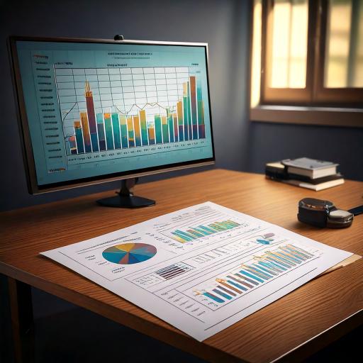
  2. Swim out to take AI head-on. AI tools mean investors can crunch a lot of research, so presentation from mining companies must be able to have that data ready to be reviewed in the right format.
  3. Stand out as Solid: An interesting aspect of mining, energy and manufacturing is that they are people + equipment + asset businesses. After the next financial roller-coast, investors will flocks back to solid investments.

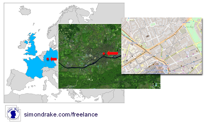
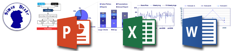
If your presentation for a mining company needs expert assistance with PowerPoint, Excel (including Chart and Graphics), adding Earth Observation, resources verification and permitting information, or implementing AI  standards, get in contact.

Competing With AI to Make Presentations

AI programs (ChatGPT, Microsoft Copilot and Google’s Gemini) are ubiquitous but they can’t help you impress the people that makes a large deal move along in the right direction.

The plethora of AI solutions are out there for anyone to use, and paid services offer more value, yet the end result is the same: Automation of research and writing. It is a great leveller, also a disappointment, but still a subtle threat to your market share.

So How Do You Compete with AI to Make Good Presentations?

The Answer is: You don’t.

Don’t worry about them. Yes, AI tools are great to assist you in creating a presentation, but AI does not create. It can appear to create, it can manifest a creation process, but it is not in touch with your customers like you are.

My personal attitude is that when creating a presentation or writing a document, AI is there to help (review, add its formulaic array of ideas) but it is your inspiration and the need to evolve your message that gives you an edge.

Most people are lazy, they will throw a few inputs at an AI program, edit the responses and think they are a genius. But at some point we can recognise sloppy AI work from lazy people because the combined output is about inspiring as derisory romance novel. There is a bold intention, but the execution is limp and lacklustre.

Never forget that it is you doing the communicating, and your voice is unique and should not be swayed or edited to fit-in like the fat-average of AI output. Your bullet points may be in your style but that’s your style. Don’t go changing.

Make Documents Readable for AI

Make Documents Readable for AI or Preparing Presentations and Documents for Client AI Review

We all use AI tools.

We receive a presentation and we ask an AI to review it; make a summary, extract 10 key points, focus on a specific area.

When you make a presentation of document, are you ready for Clients to use an AI to review your materials?

Now You Can, without much effort.

The key is that the data you create, e.g. charts, table, flow-charts, even organisation charts, can be converted to a simple format that is AI-readable. This information can be stored in your document out of sight for a view but definitely within the grasp of an AI processing your PDF.

If you are creating a presentation in PowerPoint or InDesign, or an Information Memorandum in Microsoft Word or Indesign, and yes charts in Excel, there is a process to use to ensure your valuable data can be read by an AI.

Hint: Most documents are exported as PDFs, but not all AI can read charts, and even if they can, they guestimate to give the appearance they do.

To find out more get in contact.

Strategic Charts

We live in a world of strategic definitions but very few actual images, and as the adage “a picture is worth a thousand words” implies, let a visually instructive chart show your audience what you really mean.

My experience first as a graphic designer, then as a technical writer, and lately as a manager, has shown me that indeed, a concise image can cut through mind-numbing, over-technical, jargon and drive home the message like a wooden stake through a vampire.

So impressed by own vernacular, and vast portfolio of work, I’ve included one my own charts as an example.

Note: A good strategic chart starts with a concept, then a drawing, and refinement. Here’s a pro-tip: use pens and pencils for your first drafts, get the idea out there, edit it and edit again. And then present it to an experienced communicator like myself to bring it to life.

Recreating Charts in Excel or PowerPoint

Recreating charts in Excel or PowerPoint requires patience and data entry, but now this task can be augmented by online tools.

Often charts are presented as screen shots, or scans of old presentations. Some charts have data labels, or no labels and values must be estimated.

I have access to numerous tools to hasten the process of recreating charts in Excel to be used also in PowerPoint and Word Documents.

If you would like to know more, reach out to me.

Note: AI is often used to re-create charts but my personal experience has shown that these programs can complete part of the job, but not everything. Often the present a data set, irrespective of what data is missing.

A Branding Chart

The audience aren’t branded unless you call them consumers. They are grouped however, to aid analytical study.

The biggest question of branding is ‘Who Are We Meant to Be’ is simply answered by looking at who is your Customer, and answering with ‘What They Expect’.

What a customer expects, by how a shop front, a burger wrapper or a workplace health and safety video should look, is based upon many things out of many a designer’s control. Why the look of the old-school barber shop lives on in new barber shops is a simple matter of trust, and why hairdressers may roll-out the loudest fit-out is a matter of attention grabbing. Gender preferences aside, branding is what people want (trust and attention) and what makes people inquisitive.

Branding soon becomes a creative attempt to marry what the customer expects with an artistic, tasteful, and modern design. Translating this to your business, the exact definition of what works well in your line of business, is a personal journey but the philosophy stays the same: You Are What the Customer Wants.

This determines your logo, your advertisements, your brochures and your business cards.

The Long Tail Chart

Popularised by Chris Anderson in his book “The Long Tail: Why the Future of Business is Selling Less of More’ the Long Tail chart is hardly new and has obviously benefited from an internet-star celebrity status as a chart championing the world wide web’s ability to change the world for a better place.
The internet, with its eclectic mix of herd wisdom, crowd surfing, techno-sensationalism and academic immaturity, is crowded with charts illustrating points of view that have been around for eons, and there’s no harm in acquiring new methods of introspection, even if they are window dressed goodies (but oldies).
However, The Long Tail’s valid point was not to re-invent the wheel, but just to show the web’s power. On a more sobering note, you should ask yourself, where are You in the Long Tail?

Supply Chain Diagrams

The Globalized Economy is a network of interlinked and interdependent supply chains.

A rise in oil prices sends price rises up and down the line, proof that connectivity equals vulnerability, and in a world of supply and demand, there is always profitability.

If anything can be learnt it is to know your supply chain and the factors that may alter or disrupt it.

Because the Customer is Number One, look at your business from their perspective: You’re part of the Supply Chain that brings a product into their grasp. For you though, the customer is part of a Supply Chain that supplies your bank account with funds. Interconnectivity is never limited, it is an evolving network, self-aware, and reacts to change quite rapidly.

After creating your own extensive Supply Chain, sketch an alternative Supply Chain, on the assumption that two or three vital and trusted elements were removed and needed to be replaced.